
The Problem
The previous version of the platform faced critical usability challenges. Low contrast created accessibility barriers, and confusing navigation increased user operational time.
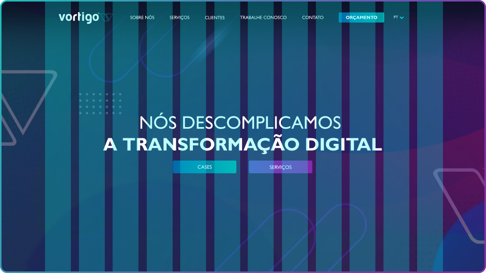
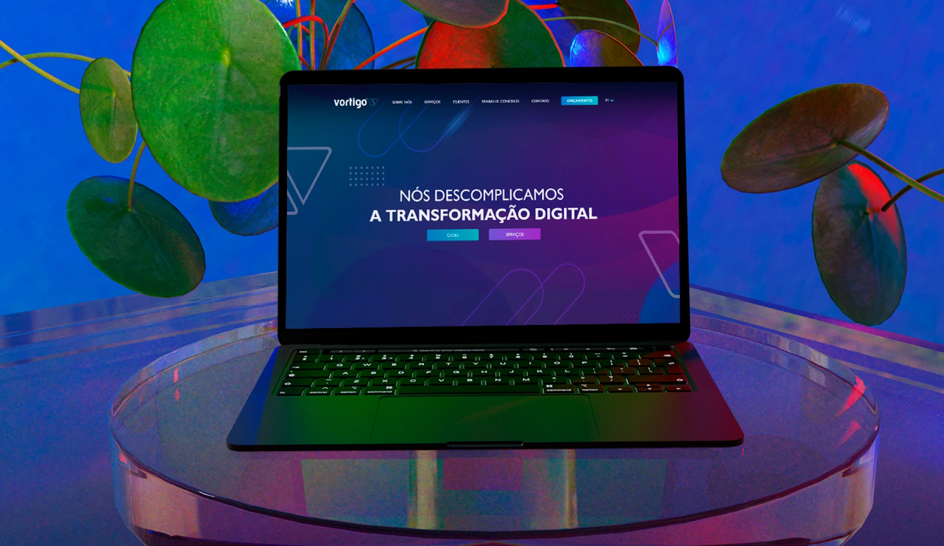
Furthermore, the visual identity no longer reflected the technological maturity of a company with 10 years in the market.
Solution
As a UX/UI Designer, I led the visual redesign focused on efficiency and inclusion. The goal wasn't just aesthetic, but functional: creating a scalable interface based on Bootstrap, fixing contrast deficits (WCAG), and optimizing the user journey to reduce task time.
Key metrics with the new User Interface
Increase in
Conversion Rate
Reduction in
Task Completion Time
Reduction in
Accessibility Errors
Increase in
User Satisfaction
Process
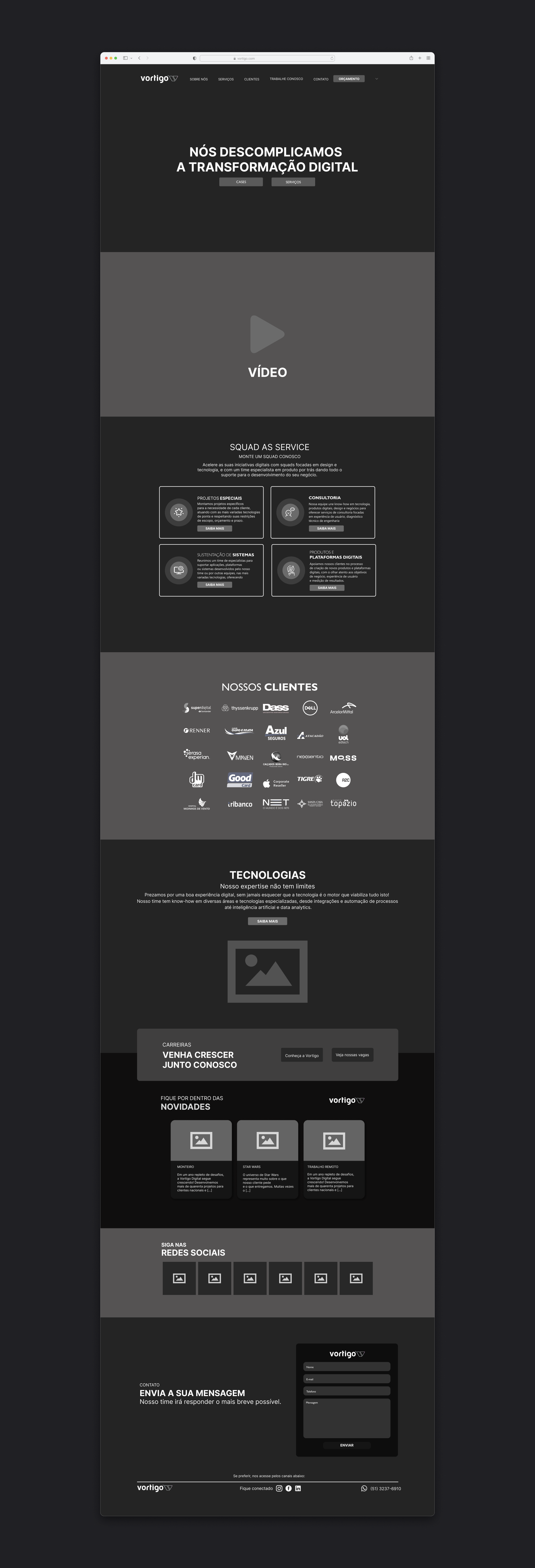
Since this was a UI redesign project, I chose a direct process focused on visual clarity. I started with low and high-fidelity prototypes to test different layout approaches. The deadline was three weeks, which required agile and objective decisions.
Grids
In this project, I used the Bootstrap 5 grid to build the page structure more flexibly.
Typography
Gil Sans MT PRO
H1 - Title - 72pts / Bold
H2 - Title - 60pts / Bold
H3 - Title - 48pts / Regular
H4 - Title - 36pts / Regular
Segoe UI
Text - Body - 24pts / Bold
Text - Body - 20pts / Regular
Text - Body - 16pts / Regular
Text - Body - 12pts / Regular
Color Palette
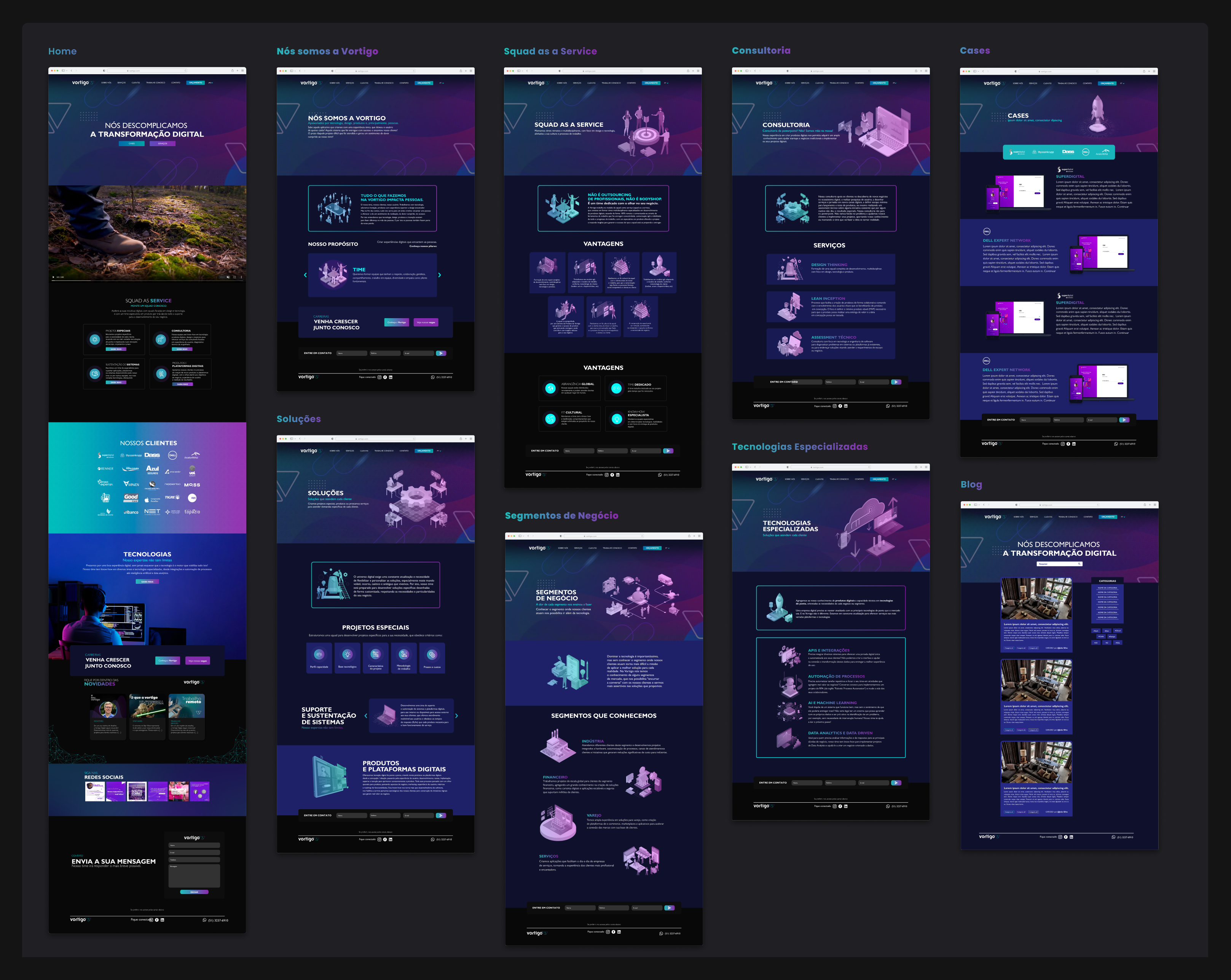
Low-fidelity Wireframe
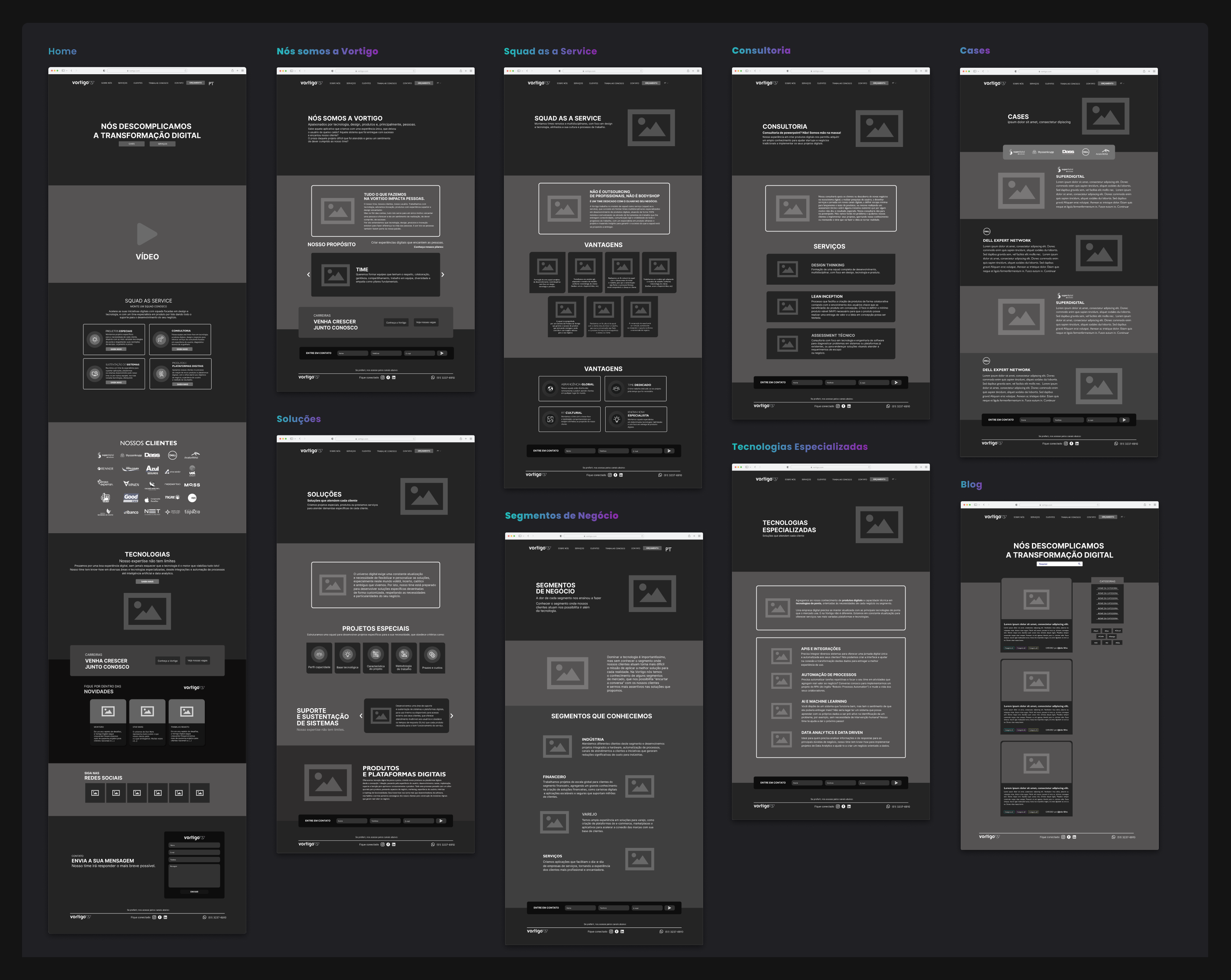
Pages
Click on the cards to view the wireframes in detail.
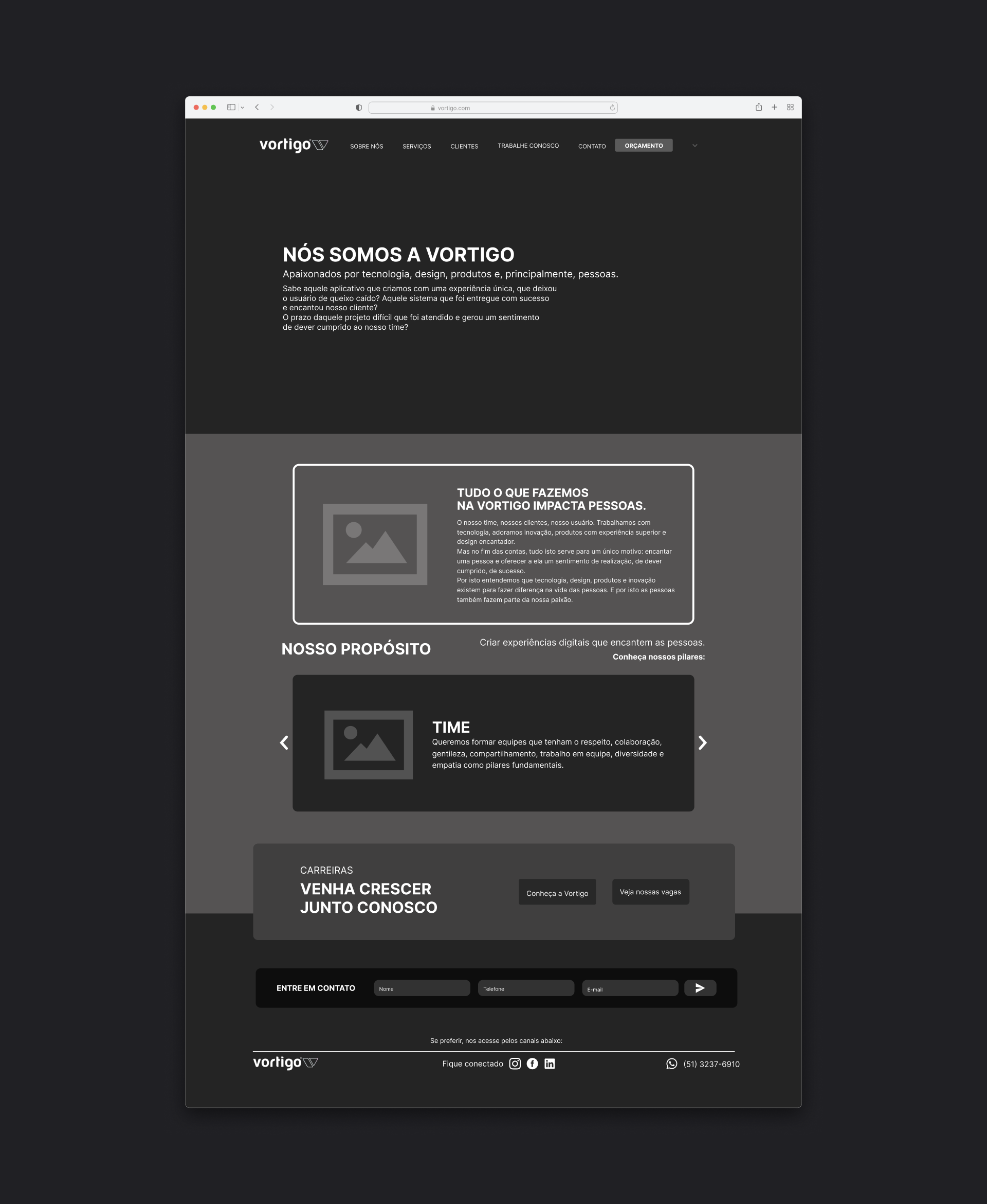
Home
We are Vortigo
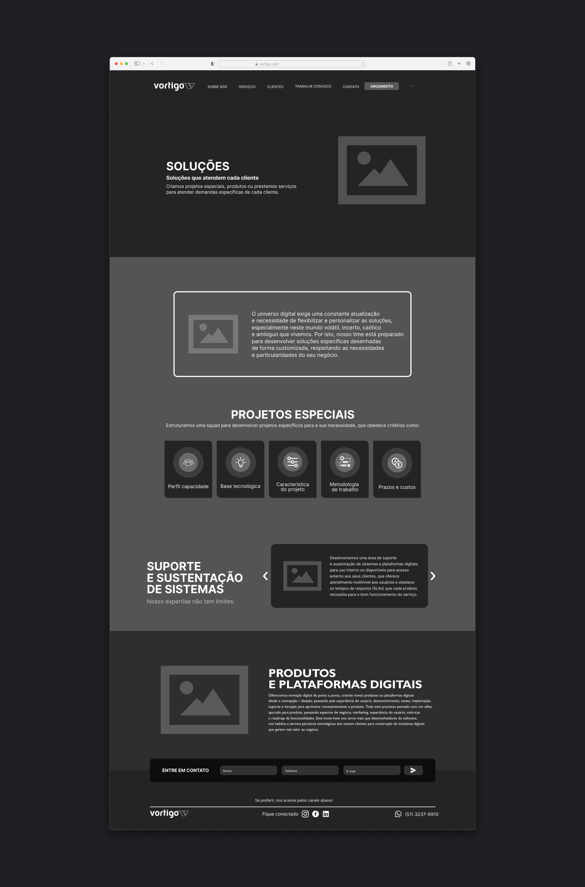
Solutions
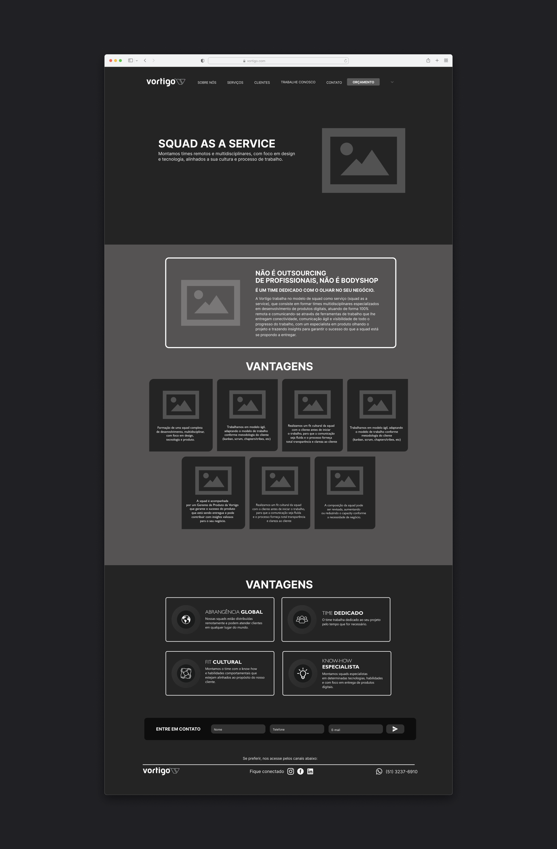
Squad as a Service
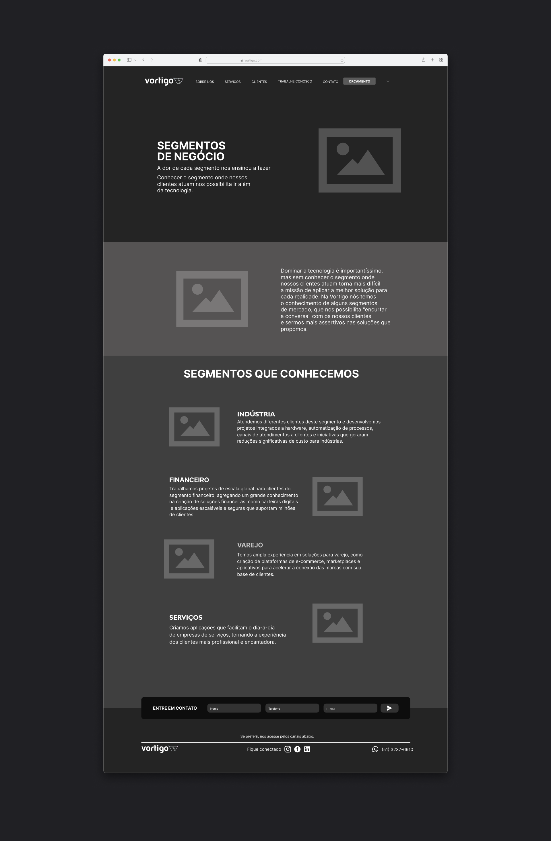
Business Segments
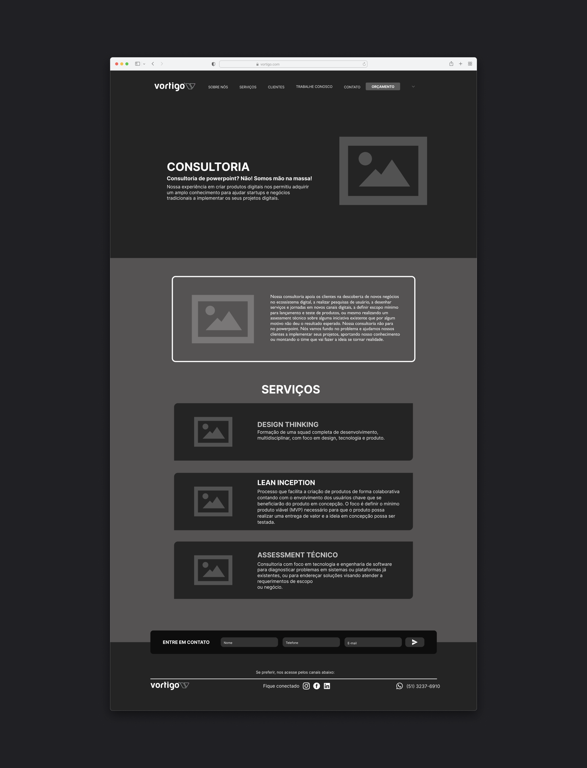
Consulting
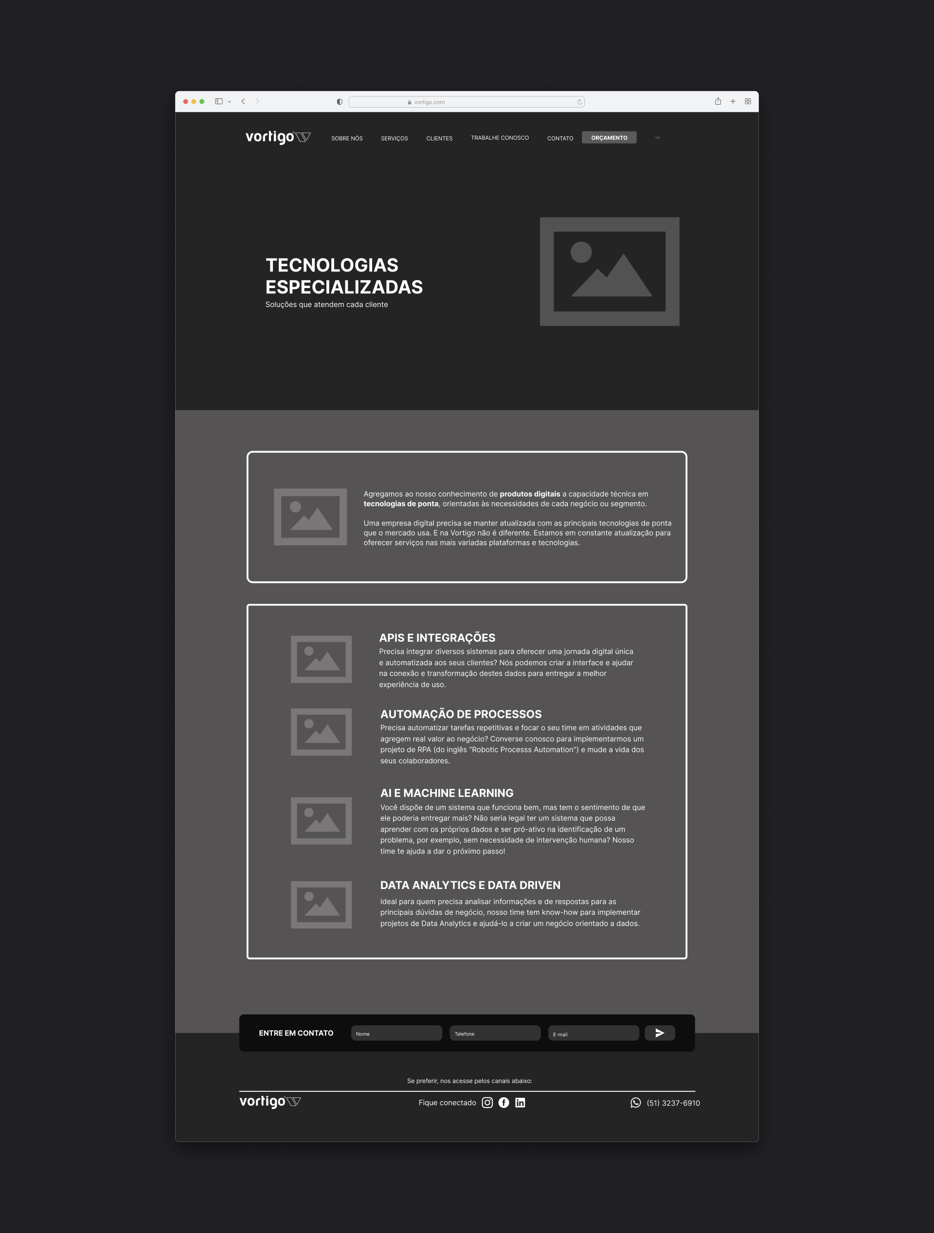
Specialized Technology
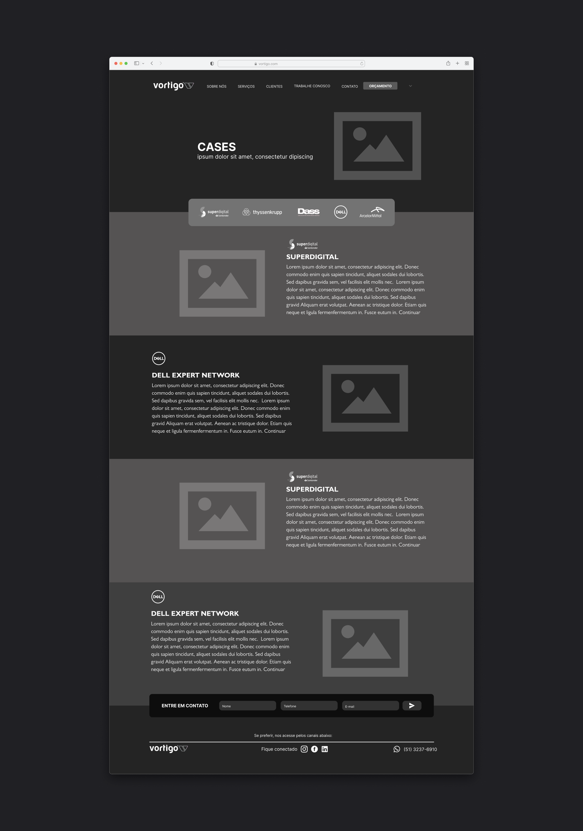
Cases
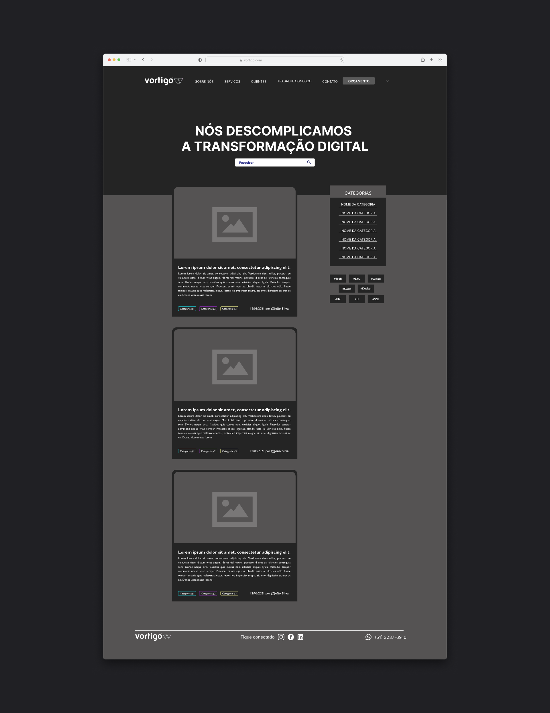
Blog
High-fidelity Wireframe
Let's Talk!
If you have an idea, a job opening, or just want to chat, send me a message.