Objective
We focused this study on optimizing color usage to meet WCAG criteria, improving accessibility. A task analysis revealed a lack of consistency and visual standardization across several screens, both in the app interface and the desktop version.
What was used?
We conducted a mapping to understand the origin of inconsistencies in practice. The diagnosis revealed that, although some modalities had undergone testing, colors were not properly adjusted for the digital interface. Furthermore, the mapping confirmed that there was no standardized guideline for color application, which was the root cause of the problems.
In practice?
Before the launch, some modalities underwent testing but were not properly adjusted, resulting in inconsistencies. It was also identified that there was no standardized guideline for color application in digital design.
Future?
Our focus was on subtle changes capable of generating significant impact. To promote a cultural transformation in the project, a comprehensive color manual was created, ensuring standardization and digital compliance from now on.
Contrast Study
+milionária
+milionária meets all WCAG requirements and is approved in terms of accessibility.
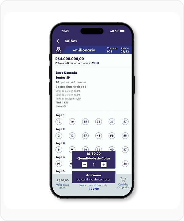
12.74:1
Simple Contrast (WCAG)
Normal Text
Large Text
lotofácil
Lotofácil also meets all WCAG requirements and is approved in terms of accessibility.
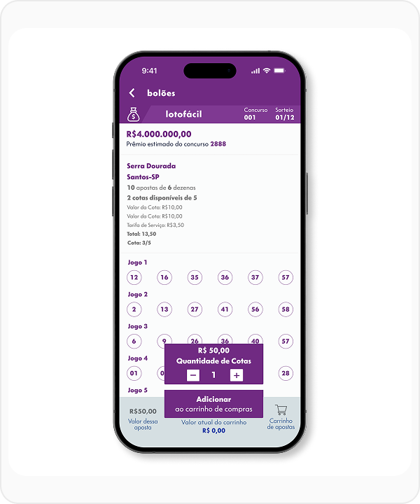
8.96:1
Simple Contrast (WCAG)
Normal Text
Large Text
loteca
By changing the original color, it was possible to reach 6.61:1, ensuring approval in all criteria.
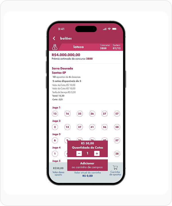
6.61:1
Simple Contrast (WCAG)
Normal Text
Large Text
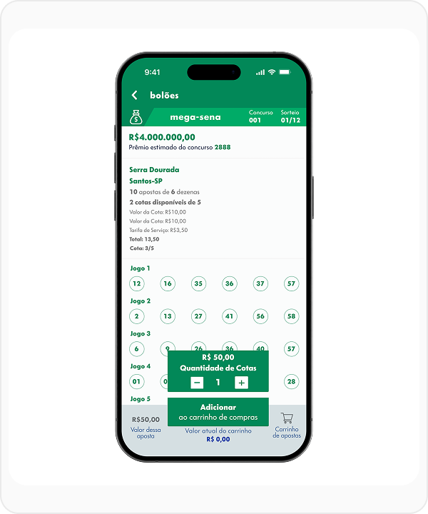
mega-sena
With the color suggested by the Loterias Caixa Manual, it was possible to reach a score of 3.57:1.
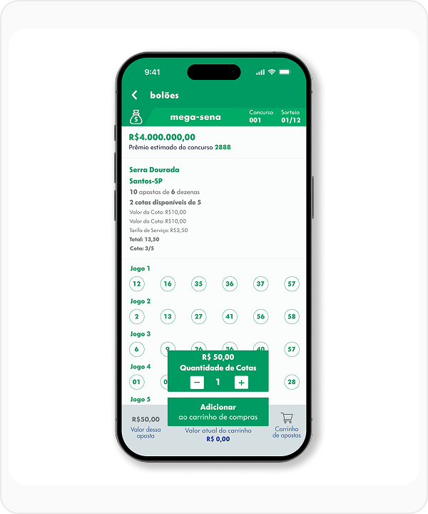
3.57:1
Simple Contrast (WCAG)
Normal Text
Large Text
The change is subtle to 4.5:1, but the increase in contrast is a gain in visibility.
4.5:1
Simple Contrast (WCAG)
Normal Text
Large Text
Changing the original color, it was possible to reach 7.15:1, ensuring approval in all criteria.
7.15:1
Simple Contrast (WCAG)
Normal Text
Large Text
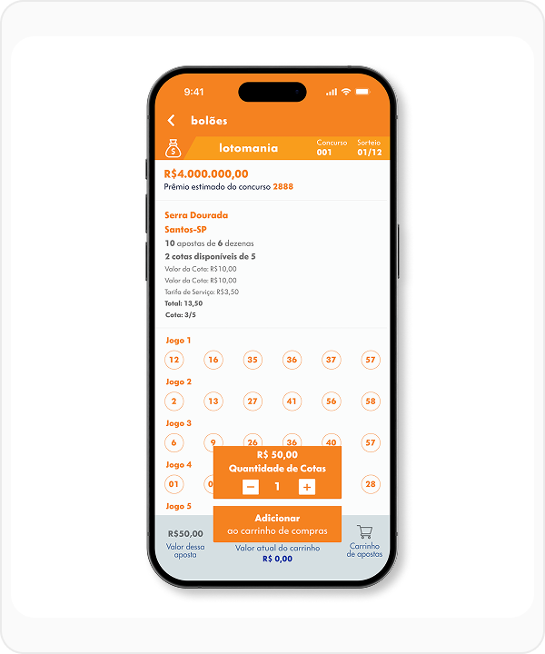
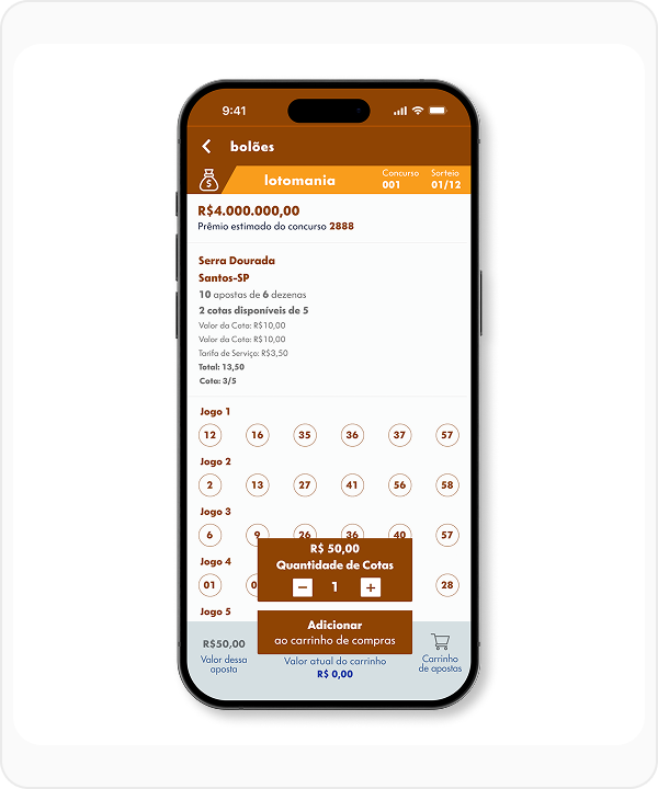
lotomania
With the original manual color, the contrast reached only 2.59:1, resulting in failure.
2.59:1
Simple Contrast (WCAG)
Normal Text
Large Text
A first adjustment, still following the manual, raised the contrast to 3.1:1, passing for large text.

3.1:1
Simple Contrast (WCAG)
Normal Text
Large Text
The second color adjustment reached 4.51:1, ensuring approval in AA criteria for all texts.
4.51:1
Simple Contrast (WCAG)
Normal Text
Large Text
Finally, the ideal color reached 7.01:1, passing all accessibility criteria (AAA).
7.01:1
Simple Contrast (WCAG)
Normal Text
Large Text
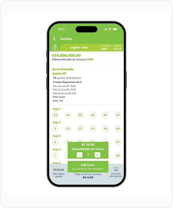
super sete
With the color suggested by the Loterias Caixa Manual, it was possible to reach a score of 2.14:1. The lowest score among all modalities.
2.14:1
Simple Contrast (WCAG)
Normal Text
Large Text
With the suggested color alongside, it is possible to reach level AA of WCAG, improving visibility and contrast of the modality.
3.4:1
Simple Contrast (WCAG)
Normal Text
Large Text
Changing the modality color makes it possible to reach AA and AAA scores only in larger texts.
4.73:1
Simple Contrast (WCAG)
Normal Text
Large Text
With the original modality color different from the original, it is possible to reach a score of 7.19:1.
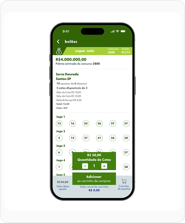
7.19:1
Simple Contrast (WCAG)
Normal Text
Large Text
timemania
Timemania has very low contrast mainly due to the yellow color.

2.24:1
Simple Contrast (WCAG)
Normal Text
Large Text
Even with color changes, it is still difficult to have good visibility.
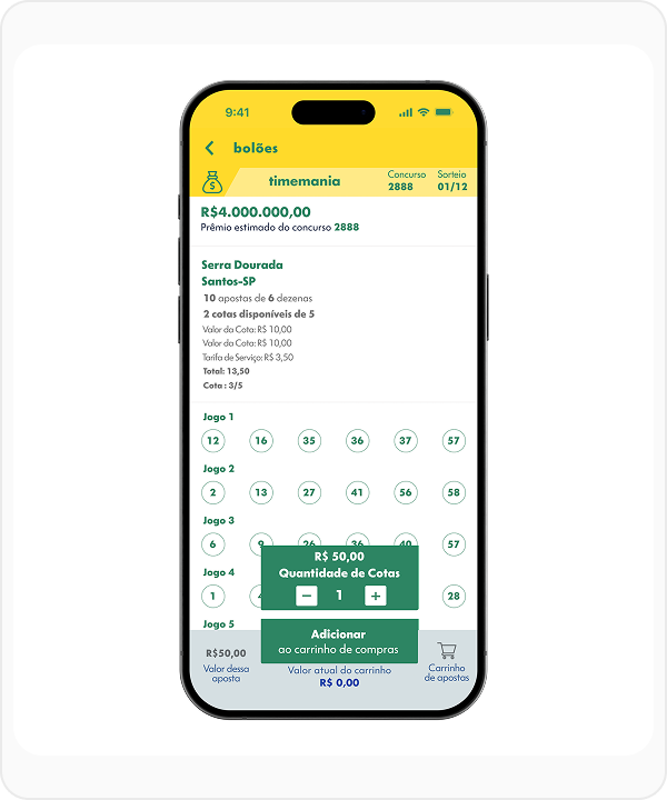
3.31:1
Simple Contrast (WCAG)
Normal Text
Large Text
The presented solutions are limited, with this color combination it is not possible to reach 7:1.
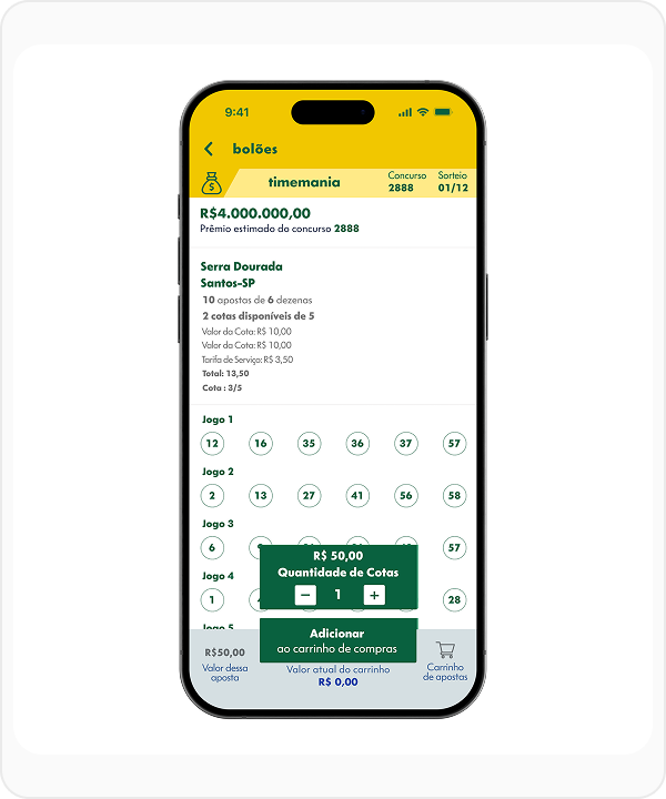
4.65:1
Simple Contrast (WCAG)
Normal Text
Large Text
Result
This study generated direct improvements in crucial points of usability and accessibility. In addition to the immediate impact on user experience, the project establishes a lasting legacy through the detailed documentation of the new colors, ensuring consistency and compliance for the future of the product.
Talk to Me!
If you have an idea, a job opportunity, or just want to chat, send me a message.