Design Manager (Caixa)
Senior UX/UI Designer
Mid-level UX/UI Designer (Me)
- Qualitative Research
- Ideation
- Interface Design
- Usability Testing
- Handoff to Devs
6 months
The Challenge
Digitize the sale of physical betting pools without breaching Lottery compliance, integrating offline legacy systems while simultaneously solving the franchisee's financial loss from unsold shares and the bettor's lack of digital convenience.
The Result
A hyper-local marketplace launched in production on the official Caixa Lotteries app — connecting bettors to the physical inventory of lottery retailers via geolocation in a single flow validated with real users.
Kick-off
We started with a detailed onboarding alongside the Product Owners (POs). This phase was crucial to absorb the product vision, understand the business objectives behind the physical-digital integration of betting pools, define the initial scope, and align expectations regarding the project's challenges and opportunities.
Project
We created a hyper-local marketplace. Instead of a generic storefront, the system uses the user's coordinates to instantly "match" with the physical inventory of Lottery retailers in their neighborhood. This digitizes the purchase, eliminates unsold shares for the agencies, and solves the bettor's logistical problem in a single flow.
Context
We conducted an in-depth benchmark analysis, investigating similar solutions in the national and international markets. We used images and interface flows from competitors to identify patterns, best practices, strengths, and differentiation opportunities, focusing on how other platforms handled the connection between online and offline.
Usability Testing
We conducted usability tests with representative users from the target audience, using the interactive prototype to collect feedback on clarity, ease of use, and overall satisfaction with the proposed solution. We presented the prototypes and test results to the POs and stakeholders for refinement and approval.
The Problem of an Analog Market
For the Lottery Retailer (B2B)
The model relied 100% on foot traffic. Any betting pool printed by the retailer that wasn't sold over the counter before the draw represented a direct financial loss for the franchisee.
For the Bettor (B2C)
Lack of transparency and convenience. The user had to physically go to the agency, wait in lines, and rely on luck to find their desired share available on paper, with absolutely no digital predictability.
The Business Complexity (Behind the Scenes)
Beyond the interface, this project required a deep immersion into state regulations and technical limitations. The challenge was to translate bureaucracy into usability without breaching the institution's compliance.
🔒 Compliance and Regulation
Unlike regular e-commerce, the Lottery Betting Pool operates under strict federal legislation. Every user interaction had to be legally validated to ensure that "digitization" did not violate the exclusivity rules of physical lottery retailers.
⚙️ Legacy Integration
The biggest technical knot was designing an experience that communicated with the Lottery Financial Terminals (TFL). We had to map specific error flows for when the legacy system (offline) didn't respond to the app in real-time, preventing transaction failures.
📍 Geolocation Locks
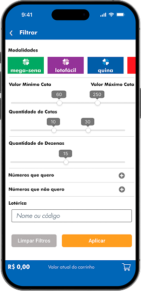
We implemented business rules based on operating radius. The system prevents sales cannibalization between neighboring lottery retailers, requiring a complex logic to display offers based on the user's latitude/longitude versus the unit's CNPJ (corporate taxpayer registry).
📊 Financial Viability
I designed the control panel for the lottery retailers with risk management in mind. The interface needed to make it clear which shares were "open" to avoid operational losses for the franchisee if the pool wasn't 100% sold by the draw.
What Happened in the Project
- Initial Alignment and Immersion: Onboarding with Product Owners (POs) to define scope, business goals, and the challenges of physical-digital integration for the Betting Pool.
- Benchmark and Competitor Analysis: Investigation of national/international online lottery solutions and platforms with geolocation features to identify best practices, user flows, and innovation opportunities.
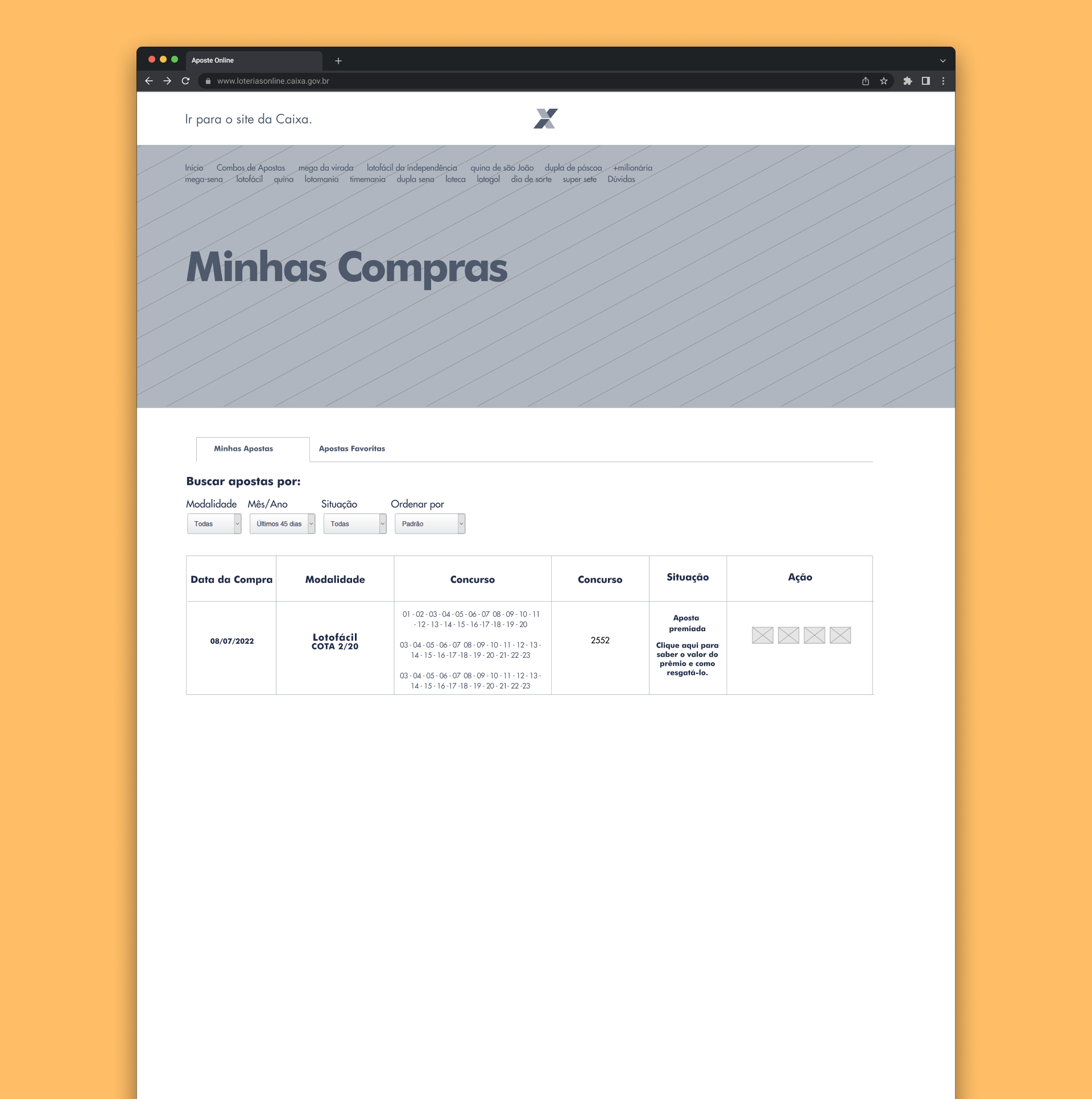
- Current Platform Analysis: Mapping the existing flow on the Caixa Online Lotteries website to identify friction points and areas for improvement in searching and buying betting pools.
- Journey Mapping (User Flows): Defining the main flows for the new feature, including the "happy path" to find and buy a nearby pool, as well as alternative scenarios.
- Ideation and Sketching: Concept generation focused on proximity search, clarity of information, and simplifying the purchasing process.
- Interactive Prototyping: Creating low-fidelity wireframes to structure information and high-fidelity navigable prototypes in Figma to visualize, test, and validate the proposed experience.
- User Validation: Conducting usability testing with the prototype to gather direct user feedback and iterate on the design.
- Development Handoff: Preparing and delivering visual specifications, documented flows, UI components, and assets for the implementation team, ensuring fidelity to the proposed design.
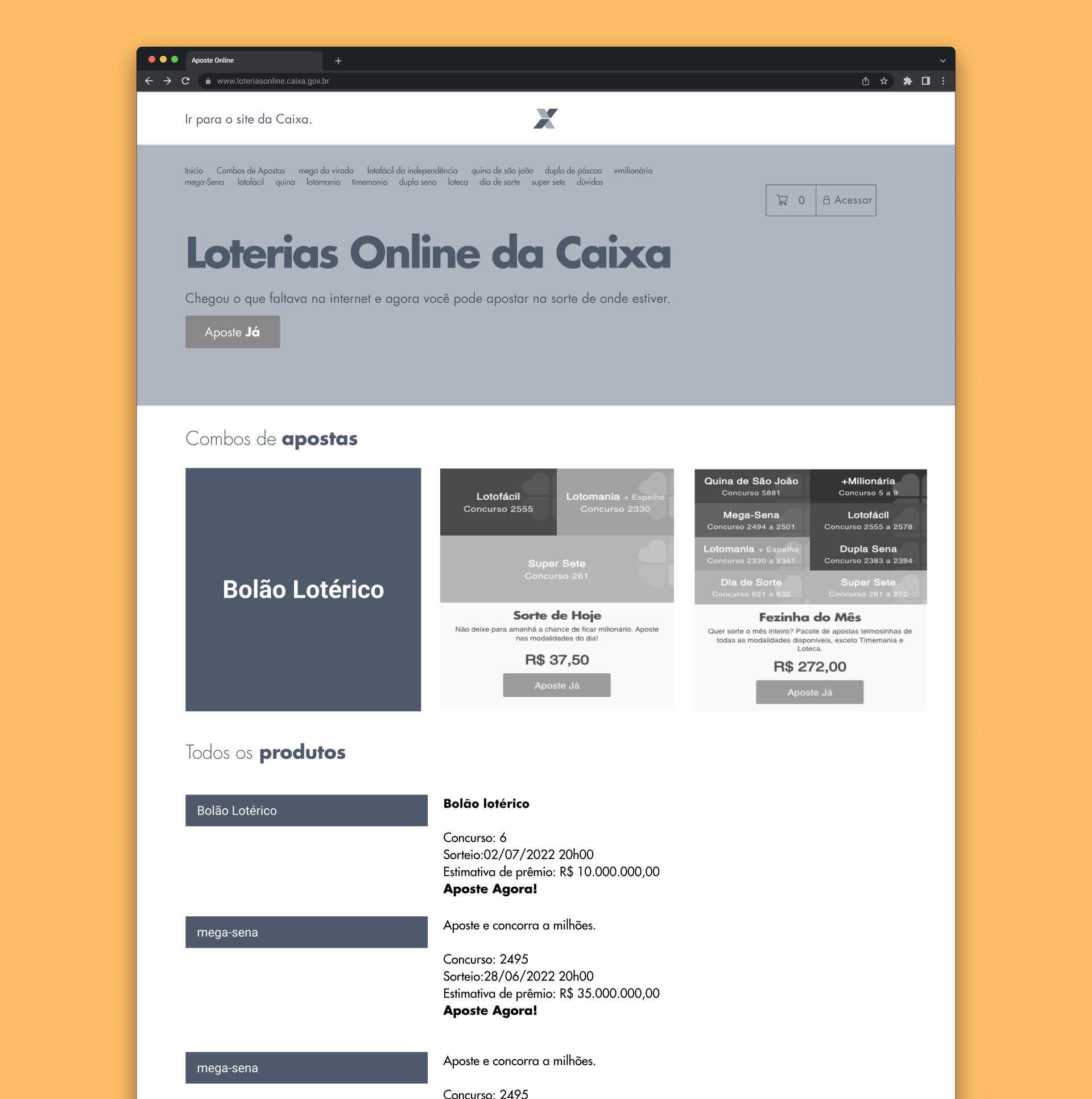
Benchmark
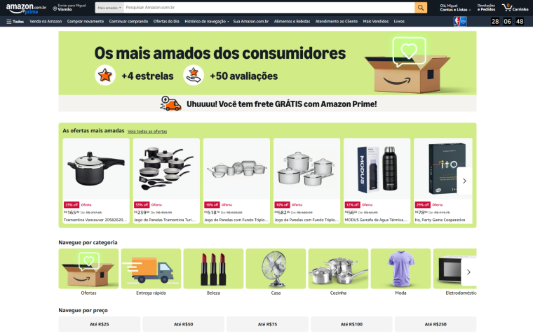
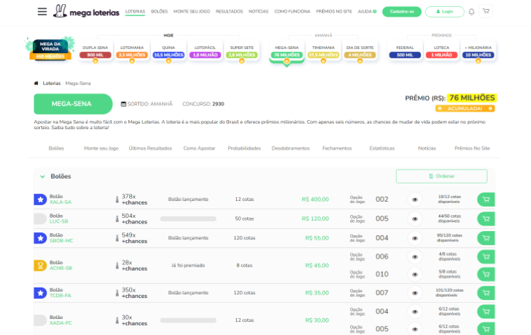
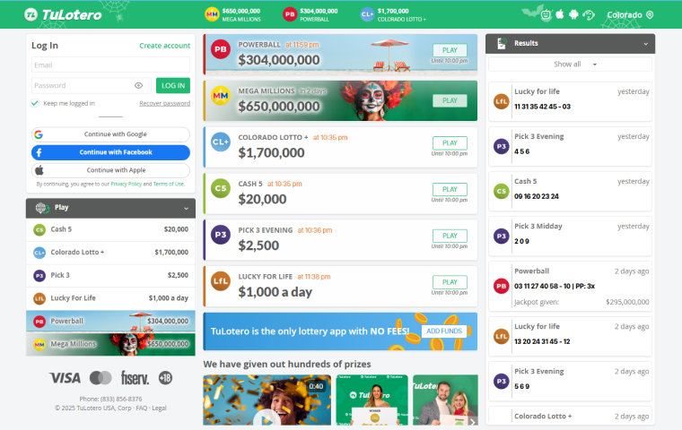
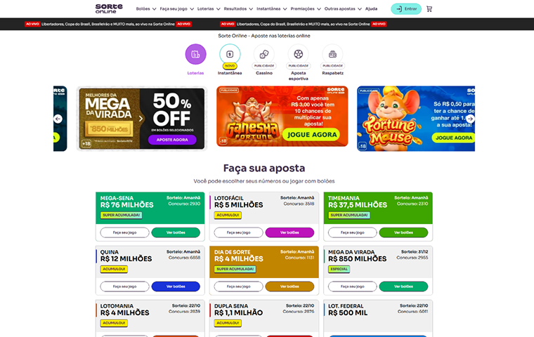
We conducted a benchmark analysis comparing the current functionality of Caixa Betting Pools with four reference platforms, including other online lotteries and services that use geolocation to connect users to physical locations. The goal was to identify best practices and innovation opportunities at key points in the user journey...
Amazon
Mega Loterias
TuLotero
Sorte Online
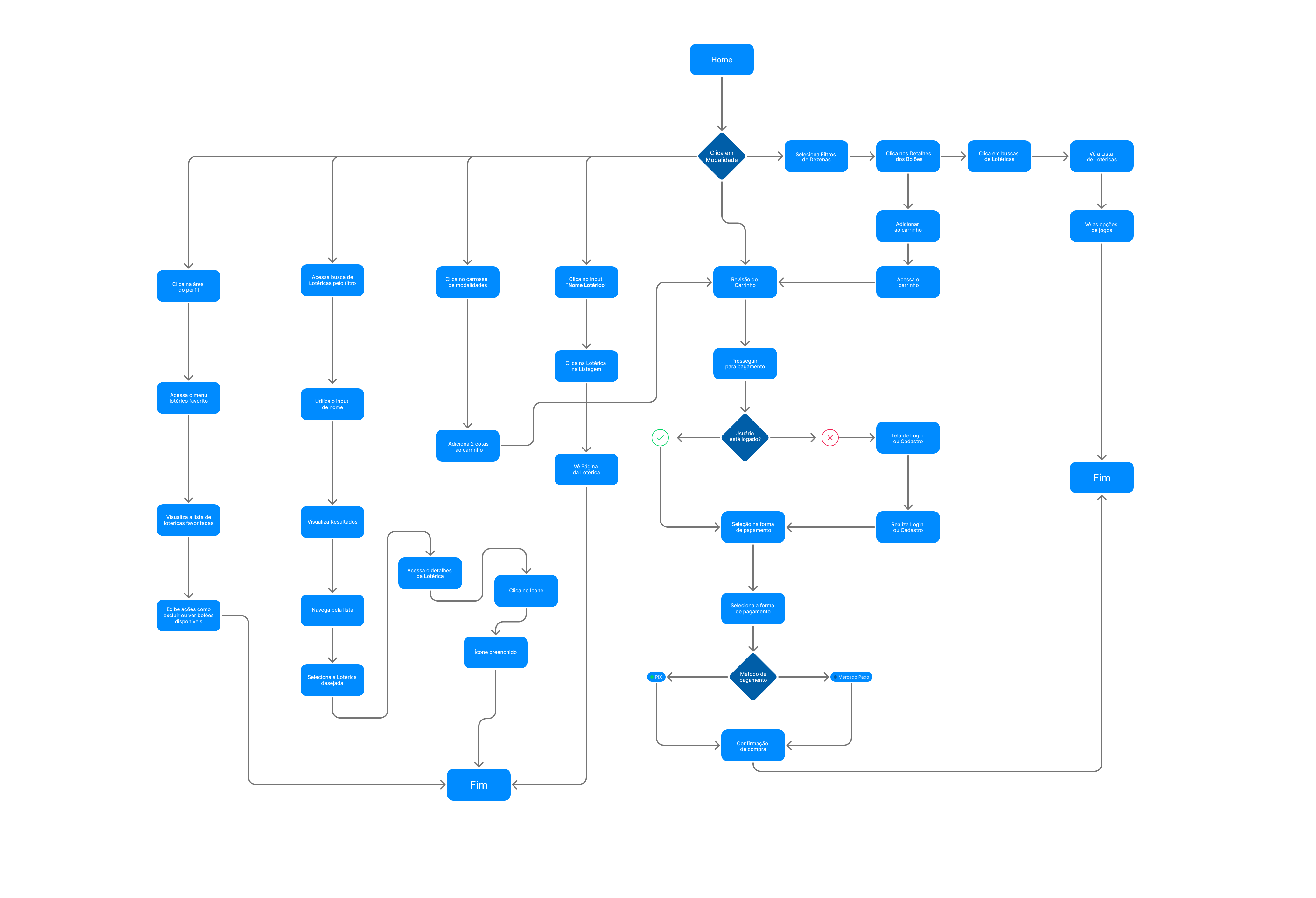
User Flow
We used User Flows to visually map the steps the user would take to find and purchase a nearby betting pool. This allowed us to visualize the entire journey, identify key decision points, and ensure the flow was as clear and intuitive as possible.
Low-Fidelity Wireframes
Low fidelity wasn't a sketch — it was a decision-making tool. In this phase, we defined three structural choices that shaped the final product: positioning geolocation as a central element of the home page (rather than a secondary filter); separating the purchase flow from the redemption flow into independent journeys from the start; and hiding less popular game types behind a filter to reduce the cognitive load of the main screen.
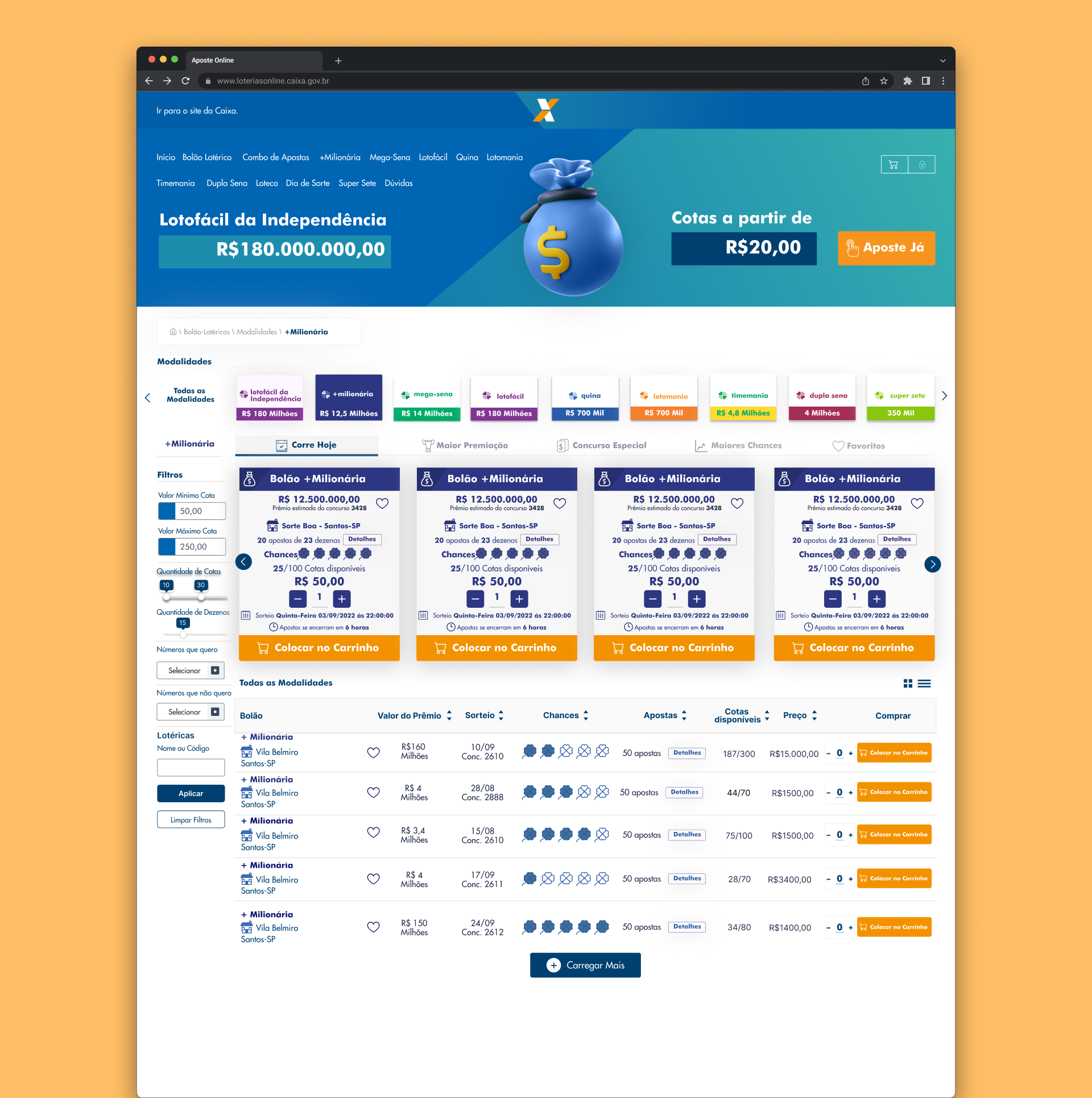
Desktop Betting Pool Home Screen
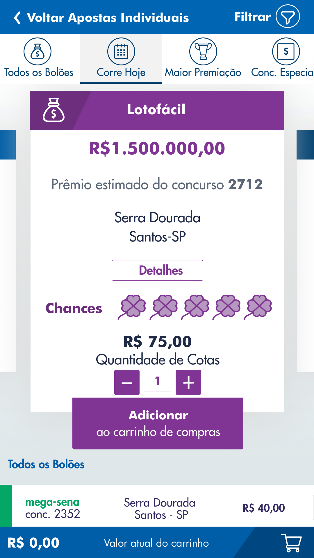
Map as a hero element — a decision to prioritize the physical dimension of the product (the nearby lottery retailer) over the digital list of available pools.
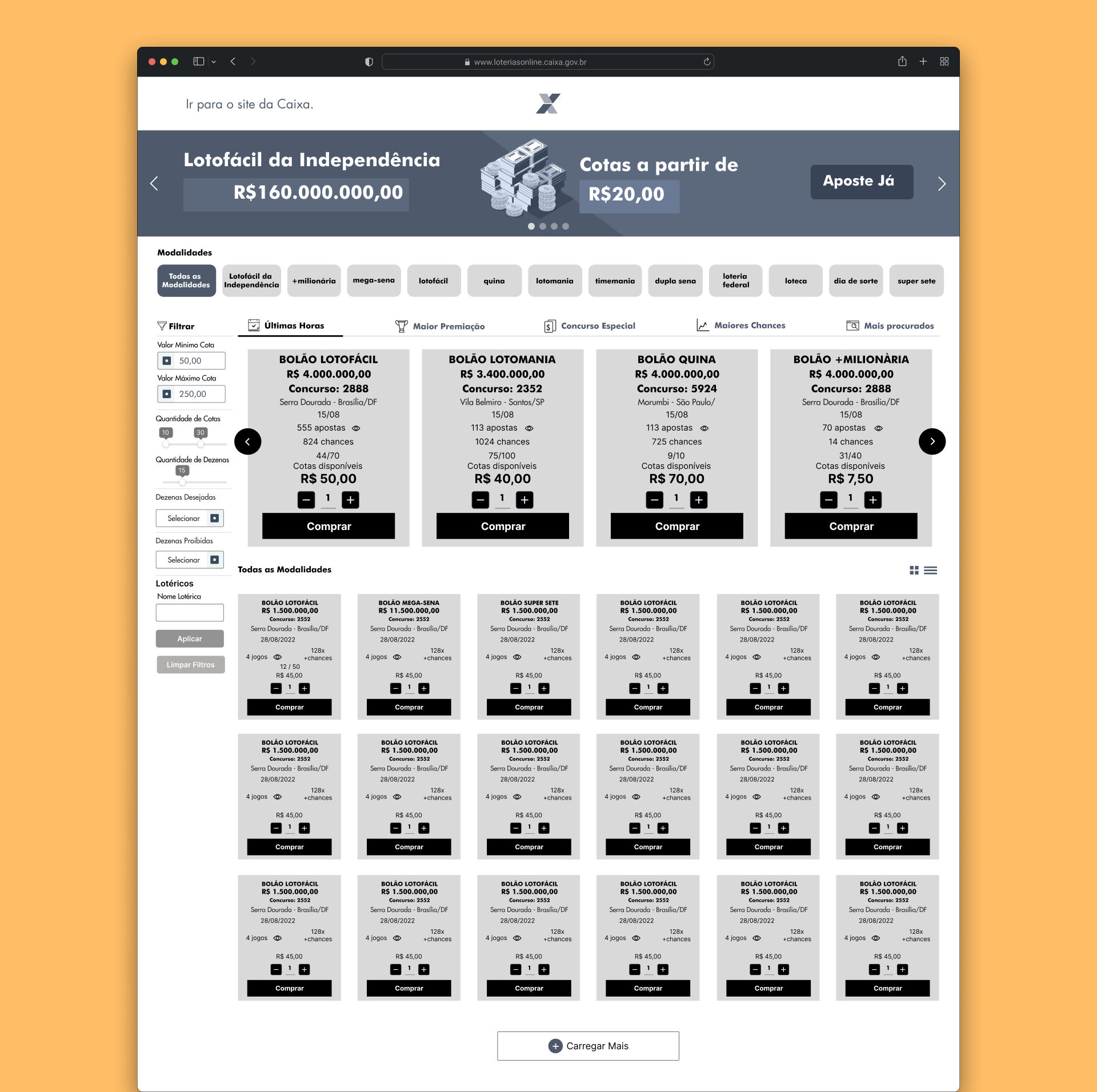
Game Types Structure
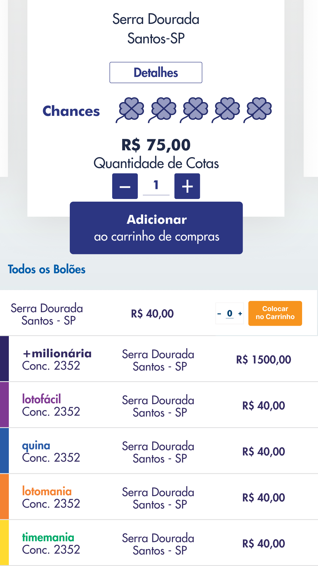
Visual separation between available and closed pools defined here — reduces the frustration of clicking on something unavailable before seeing the content.
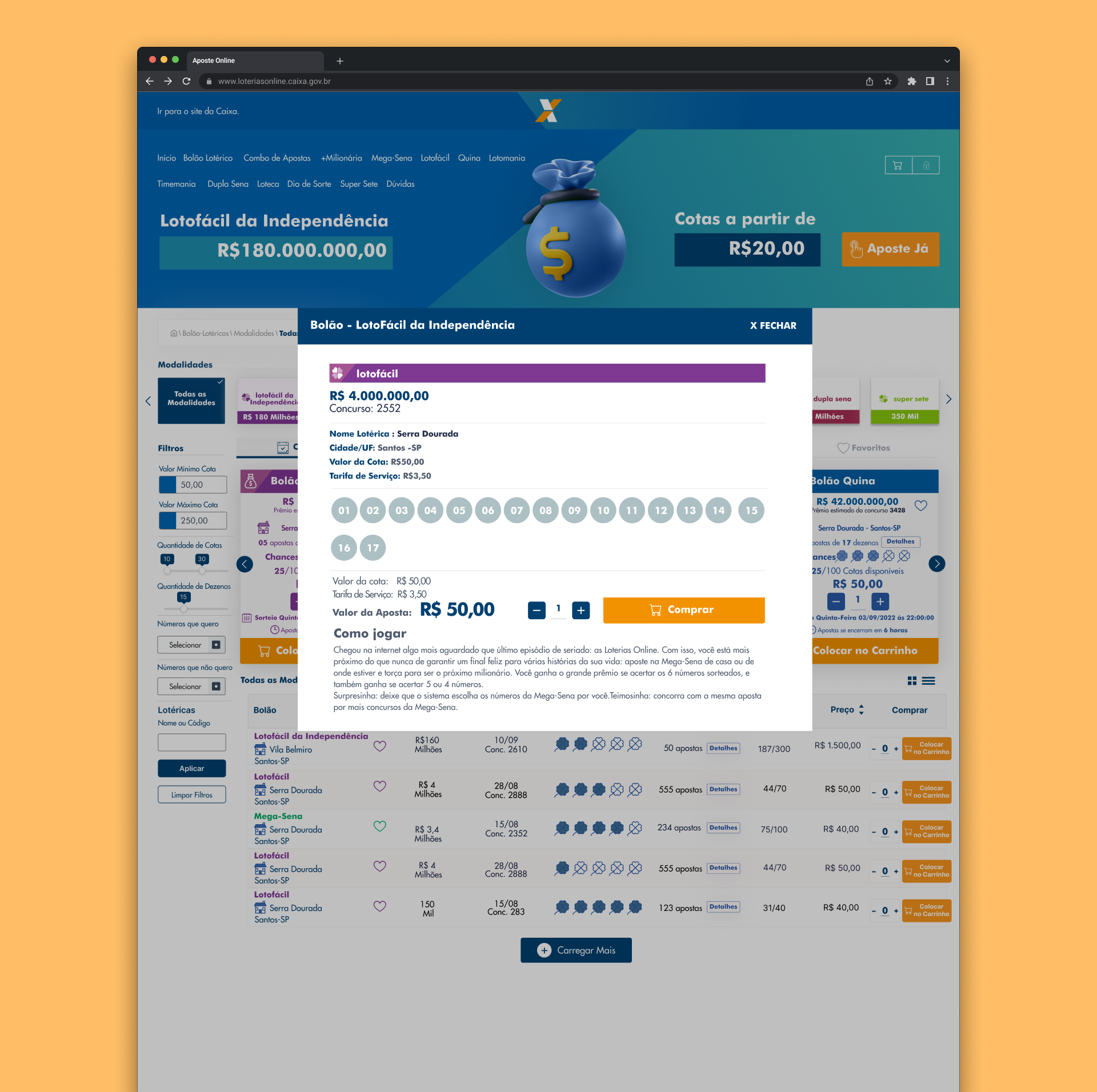
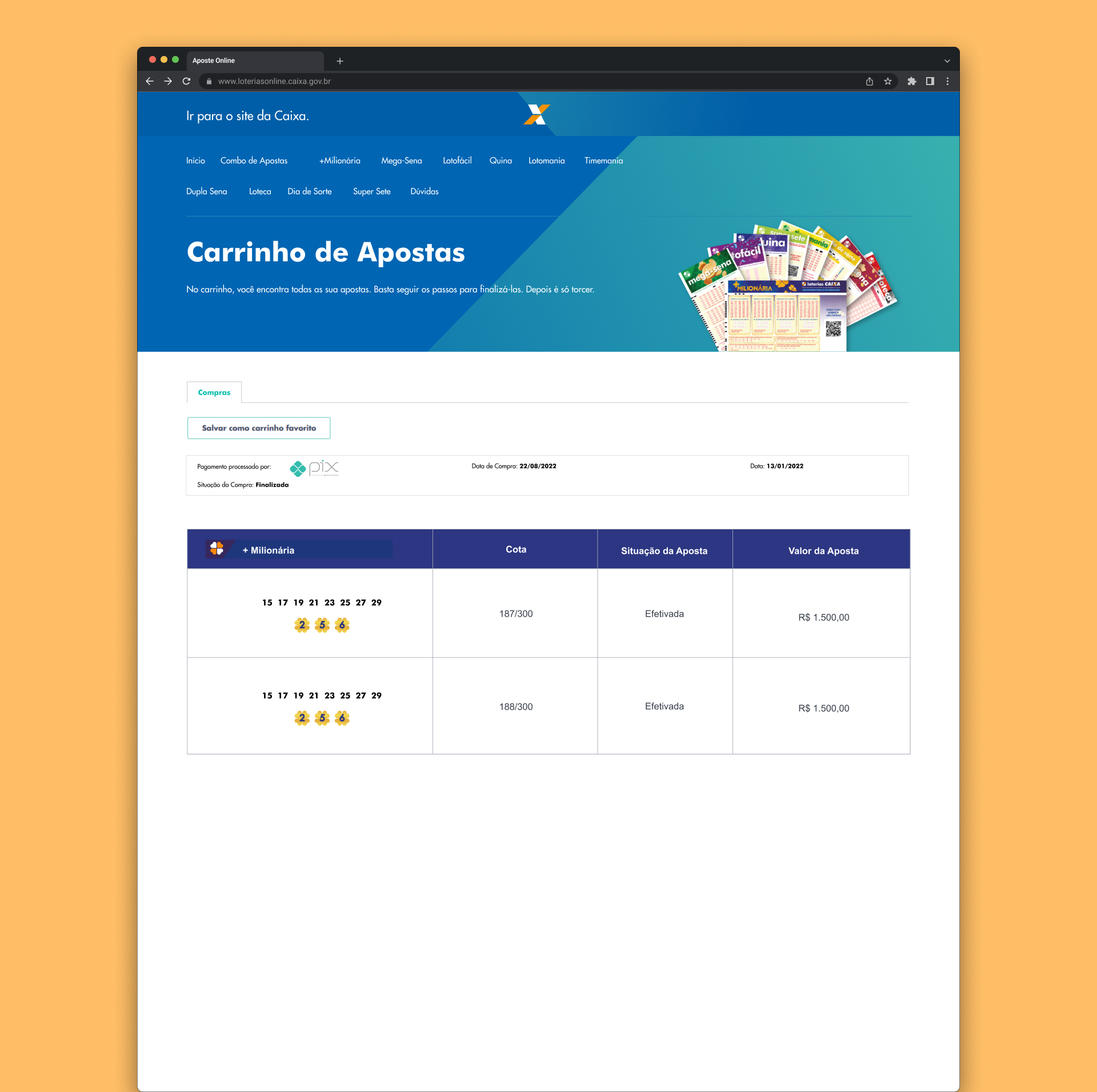
Selection and Checkout Flow
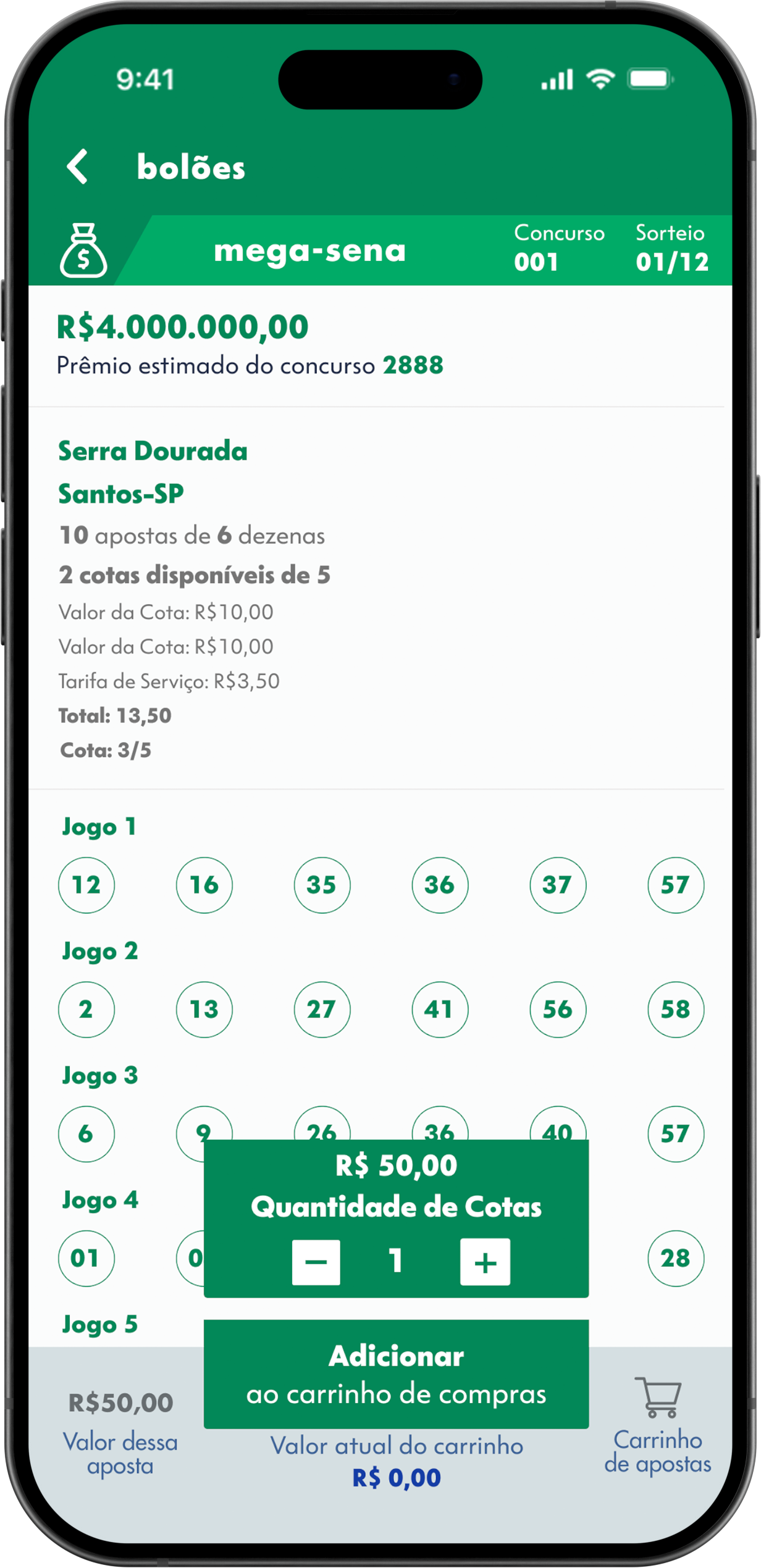
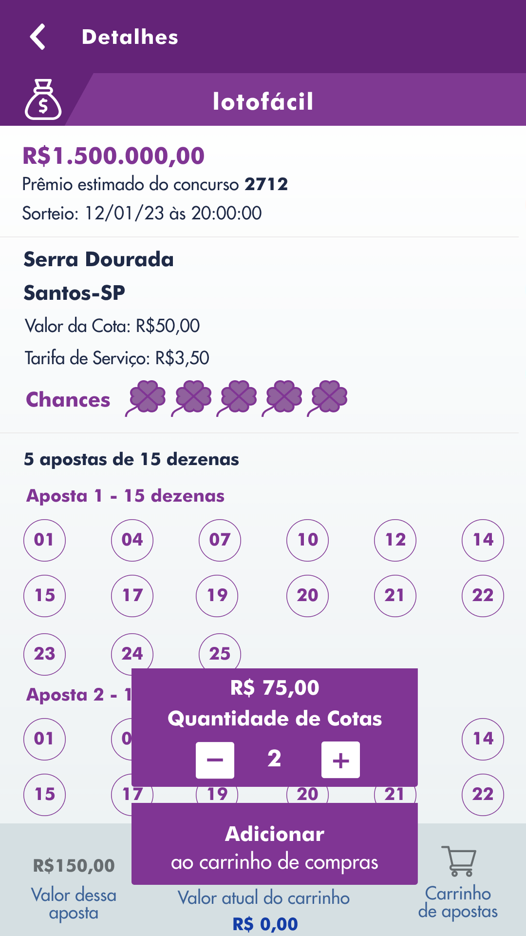
First validation of the purchase funnel: defining how many steps the user takes from the pool card to payment confirmation.
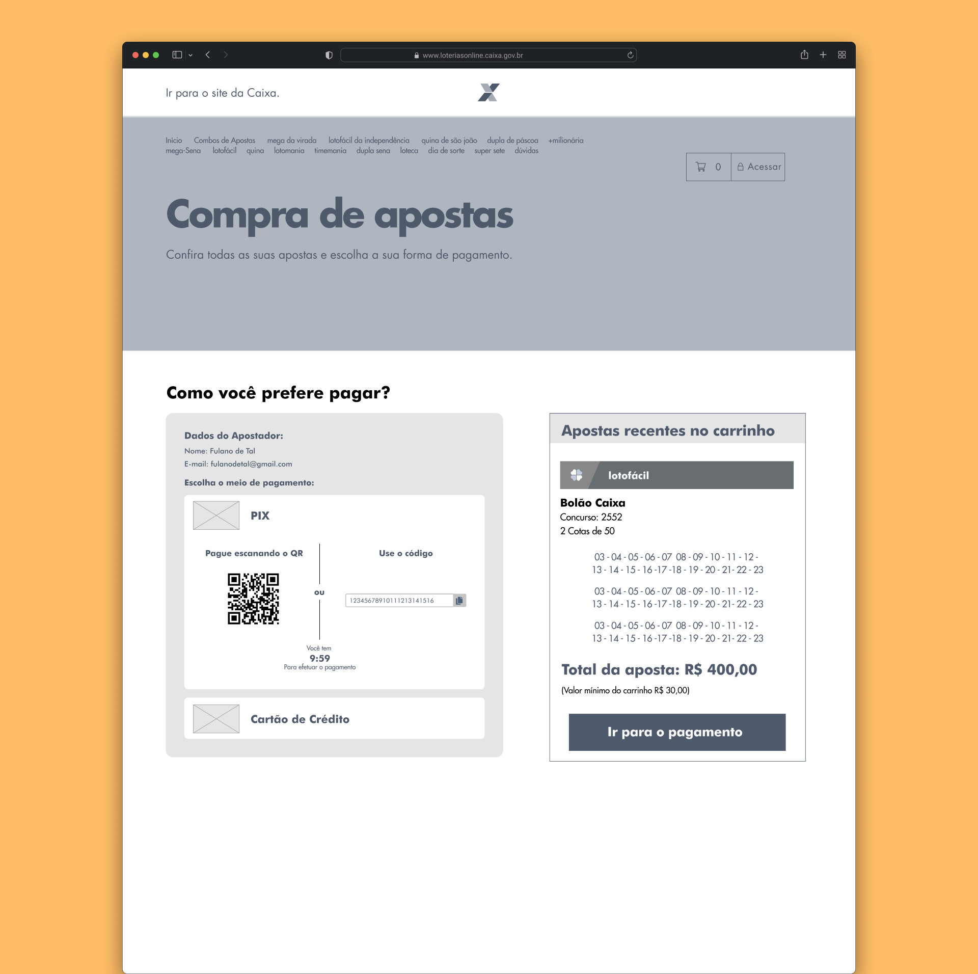
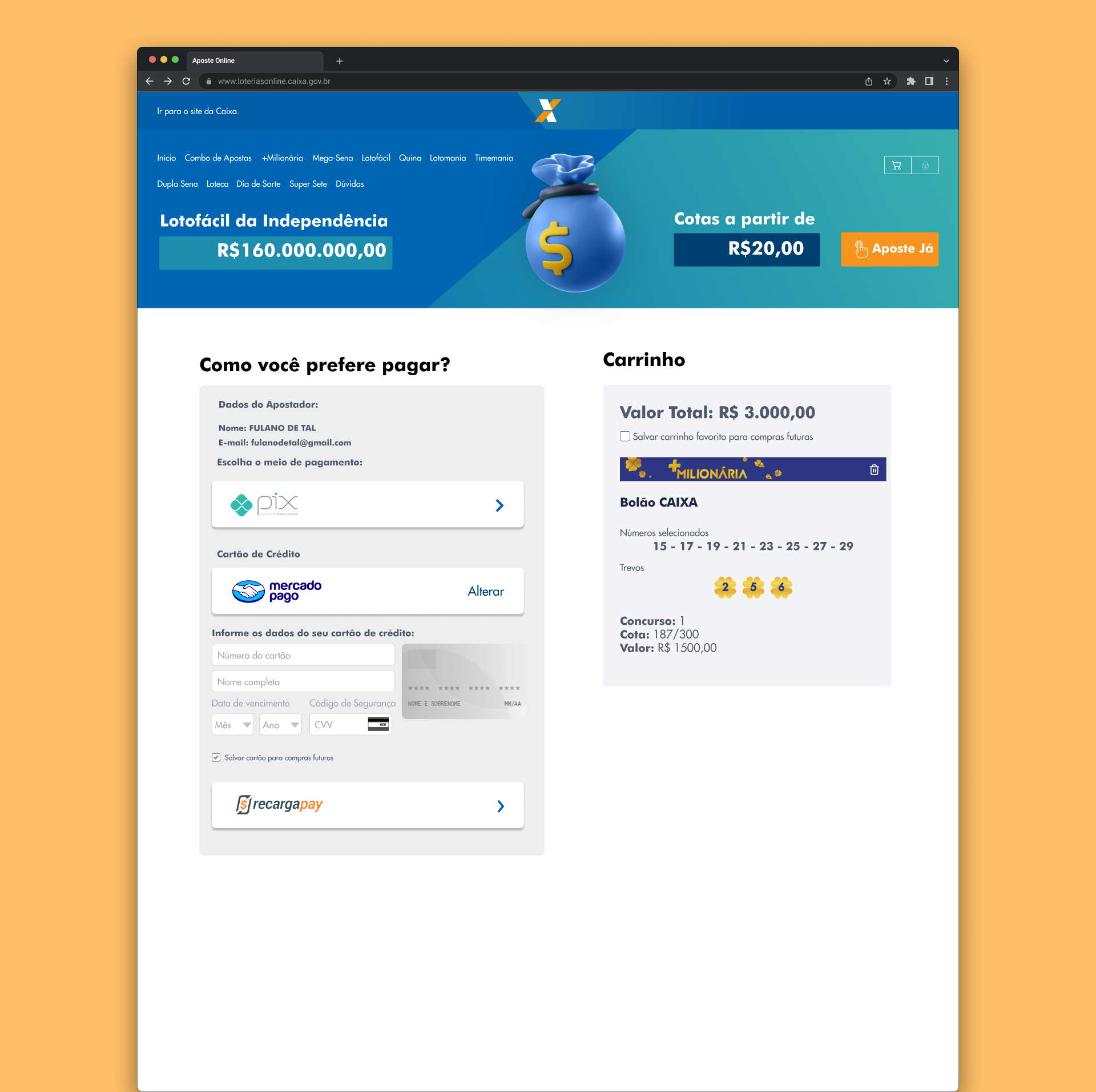
Pix (Instant Payment) and Order Review
Review screen designed so the user can confirm the retailer, share amount, and price on a single screen — avoiding abandonment due to uncertainty in the final step.
High-Fidelity Wireframes
Advancing from the structure validated in the low-fidelity wireframes, the high-fidelity version incorporates the complete visual layer of the product. In this phase, we applied the defined visual identity (colors, typography, components) to create an accurate representation of the final interface.
Important: The screens presented are a representative example. The complete project covered the flows of all lottery game types, including variations for seasonal events like the New Year's Mega-Sena, ensuring consistency across the entire platform.
High-Fidelity Home
Betting Pool Details Modal
Payment Screen
Payment Detail
The Mobile Experience
With the wireframe structure validated, we applied the final visual layer. The focus was to convey trust and clarity. We used Caixa's institutional palette, but with a modern UI approach to highlight the main actions.
Press play on the video to see the complete flow, from selecting the betting pool on the home screen to payment confirmation on mobile.
Home Screen
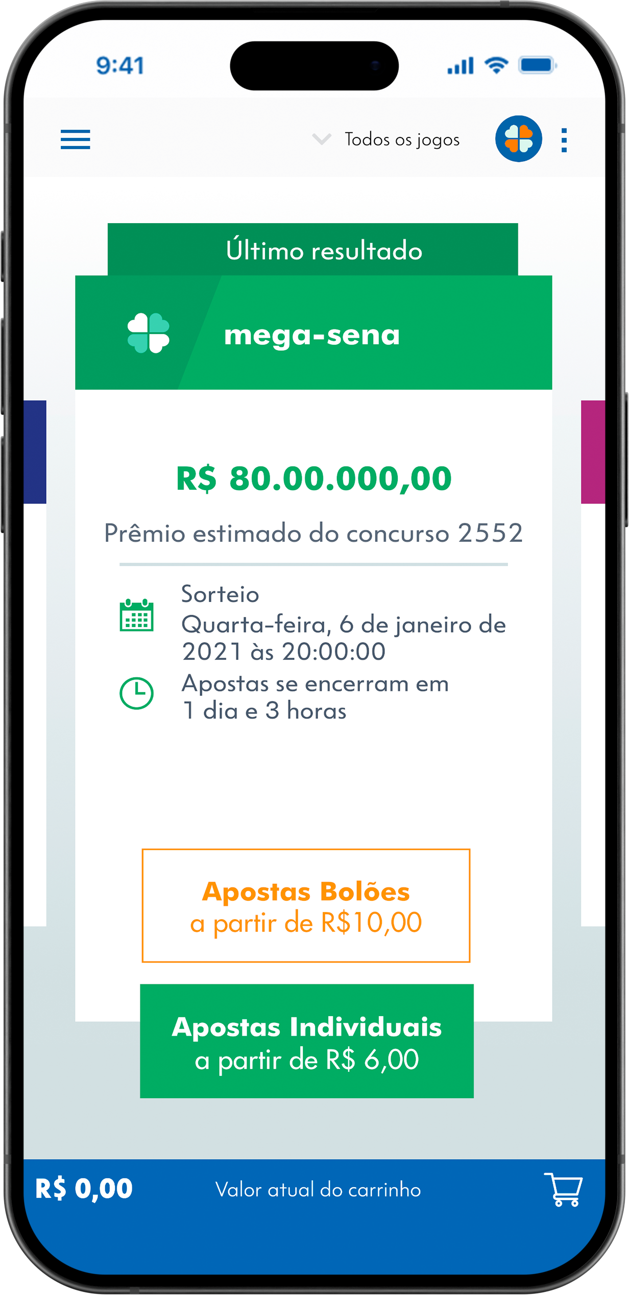
Pool Selection
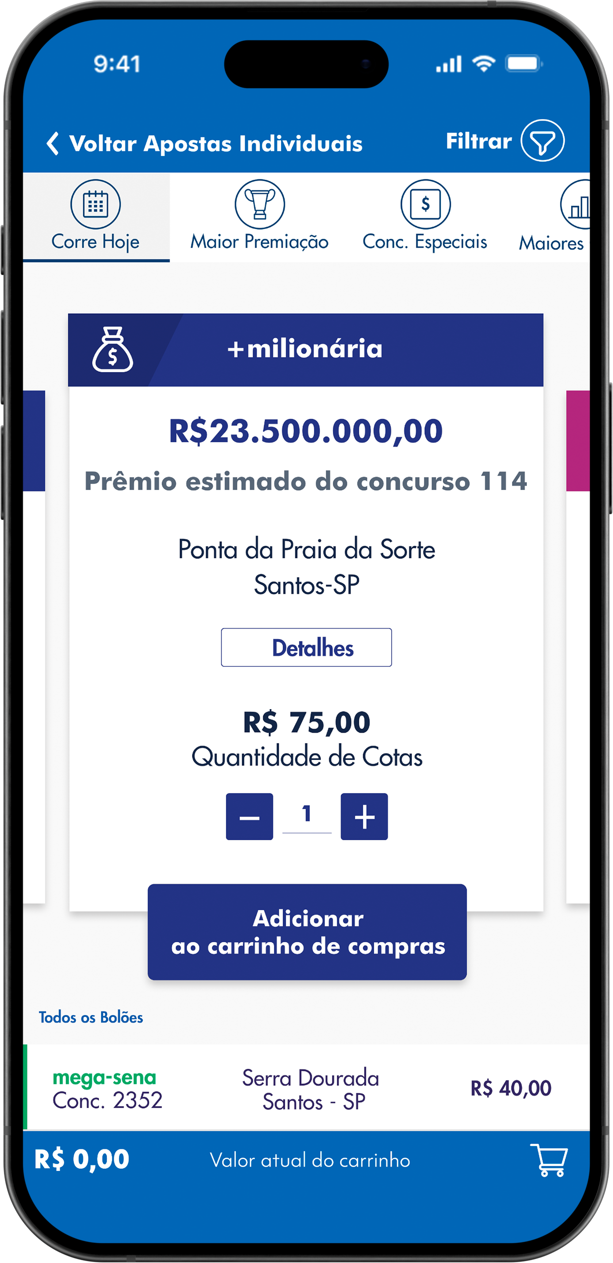
Game Detail
Filters
Structure and User Validation
To ensure the integration from physical to digital betting pools would be seamless, we divided the usability test into four main missions, focused on mapping navigation friction and cognitive load.
Discovery and Distinction
The Scenario: You want to place a Lotofácil pool bet with a prize of 1.5 million.
The Mission: On the Lotofácil card, select the "betting pool" option and log in.
Share Configuration
The Scenario: It's time to add the number of shares and go to the shopping cart.
The Mission: Enter the game "details", add 2 shares to the pool, and proceed to payment.
List Selection
The Scenario: You can also choose your betting pool through the list of available shares.
The Mission: Choose the QUINA game from the list of available pools and add 1 share to the cart.
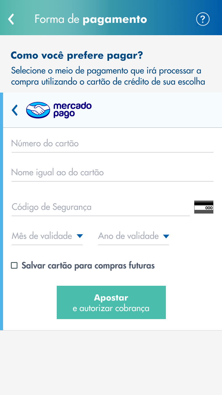
Checkout and Payment
The Scenario: The final step is payment. To complete it, you will use a credit card via Mercado Pago.
The Mission: Add your buyer details and finalize the purchase with the card.
Metrics Evaluated
- Efficiency: Navigation speed and fluid transition between funnel stages.
- Cognitive Load: Focus on visual recognition rather than recall (Nielsen's Heuristics).
- Friction: Mapping hesitations or doubts in the transition between fields and payment screens.
Key Findings and Action Plan
01. The Text Paradox
The Friction: Most users were lost with the large amount of text on the initial menu. It was the task with the longest time and highest dropout/help rate.
"I thought there was too much text. The content should be just one line."
02. Unknown Icons
The Friction: Fluid navigation and 100% success rate, however, a specific doubt arose about the iconography ("clovers") on the card.
"What are the clovers?"
03. The Visual "Wall"
The Friction: No user was able to complete it without help. The list of pools below the main card looked like a static footer, and they didn't realize the screen was scrollable.
"I don't see any list button here. The first line seemed like a footer."
04. Price Alignment
The Friction: The fastest step of the test. The only caveat was the information architecture of the values (games on the right vs. cart on the left).
"Normally in shopping carts, the values are shown in the same column."
Results & Iterations
The usability tests were not the end of the process — they were the turning point. The friction points mapped in the four tasks generated a direct iteration plan, which was prioritized, implemented, and validated before the official launch of the new app version.
🔁 From research to production
All four improvement actions identified in the tests were implemented in the final iteration of the prototype. The initial navigation redesign, iconography tooltips, scroll affordance, and value realignment were incorporated into the handoff for development — and the new version went into production.
📲 Launch in production
The project was delivered to production and integrated into the official Caixa Lotteries app, used by millions of Brazilians. The complete journey — from onboarding with POs to production delivery — demonstrates that UX decisions were backed by data and accepted by stakeholders.
Business metrics are the property of Caixa Econômica Federal and cannot be publicly disclosed.
📉 Reduced cognitive load
Task 01 — the one with the most friction, with an average time of 1m36s and 3 out of 5 users needing help — was directly addressed by simplifying the initial menu. Removing the textual "step-by-step" from the buttons prioritized interactive navigation, aligning the interface with the principle of recognition over recall.
✅ Method validation
Task 04 — checkout and payment — was the fastest in the test (0m45s, 4/5 success), confirming that the integration with the payment gateway, designed focusing on e-commerce mental models (Jakob's Law), was already adequate even before the final iterations.
Project Timeline
- Kick-off & Immersion Alignment with POs, definition of scope and business objectives.
- Benchmark & Discovery Analysis of national and international competitors focusing on geolocation and lotteries.
- Architecture & Wireframes User flows, low and high fidelity, covering error and compliance scenarios.
- Usability Testing 5 users, 4 tasks, identification of 4 critical friction points.
- Iteration & Corrections All improvement actions implemented in the final prototype.
- Handoff & Production Delivery to development and launch of the new app version.
Let's work together?
If you have an idea, a job opening, or just want to chat, send me a message.